Saturday, October 10, 2009

Activity 19: Restoration of blurred image

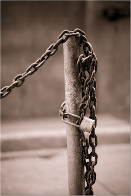
In the previous activity, we only considered adding noise but without the application of the degradation function. In this activity, we perform restoration for an image degraded by a known function h(x,y) and added with noise n(x,y) (see FIG 1 of activity 18 for the image degradation and restoration model).
FIG 1: Degradation process of an image f(x,y) by convolution of the degradation function h(x,y) with the image f(x,y) and addition of nosie n(x,y). By the convolution theorem this is represented as multiplication in the frequency domain represented in Eq (2) where capital letters denote the Fourier transform of the smaller letters in Eq (1). The '*' operator denotes convolution.

In this activity we consider uniform linear motion blur and obtain an estimate of the analytical form of this kind of blurring. Thus, we find the transfer function H(u,v) of the motion blur.

Estimate of the degradation function, h
Assuming that the opening and closing of the shutter of the imaging device occurs simultaneously and considering perfect optical imaging process, the degraded image g(x,y) in the frequency domain can be represented by Eq. (2) where the transfer function H follows the form below.

FIG 2: Estimate of the transfer function for uniform linear motion assuming perfect optical imaging and instantaneous opening and closing of the shutter of the imaging device. Where T is the duration of the exposure, a and b are the total distance for which the image was displaced in the x and y direction respectively.

Restoration of the degraded image g(x,y) to f^(x.y)
In this activity, we use the Wiener filter which minimizes the mean square error between the restored image (f^) and the original image f. i.e., min{|f^-f|} The Wiener filter assumes that the image and noise are random processes and ncorporates the statistical properties of the noise and degradation function in the restoration process. The minimum of the mean square error is given below in the frequency domain as:

FIG 3: Wiener filter. H(u,v) is the degradation function from Eq. (3), |H(u,v)| = H*(u,v)H(u,v) where H*(u,v) above denotes complex conjugation, Sn(u,v) = |N(u,v)|^2 and Sf(u,v) = |F(u,v)| ^2 are the power spectrum of the noise and the undergraded image.

FIG 4: Transfer function H (frequency space, left) and the equivalent function h in real space, (right) for T=1, and a=b=0.01.

The image below shows the results for an image degraded by H and added with a Gaussian noise of mean = 0.01 and var = 0.01 generated using scilab's grand function.

FIG 5: Test image degraded by H following the form of Eq. (3) with T=1, a=0.01, b=0.01 and added by a Gaussian noise of mean=0.01 and variance = 0.01. The restoration using Wiener filter of Eq. (4) is visually successful.

Usually when we are dealing with real images, the power spectrum Sf(u,v) of the undergraded image is unknown. We can estimate Eq. (4) by assuming a white noise with a constant power spectrum reducing Eq. (4) to the equation below.
FIG 6: Estimate of the Wiener filter.

For different values of K, we reconstruct the degraded image as shown in the images below.

FIG 7: Reconstruction for varying values of K = [1e-4 1e-3 1e-2 1e-1 1] for degraded image with T=1, a=b=0.01 added with Gaussian noise of mean = 0.01 and variance=0.01.

Comparing the Wiener filter reconstruction with the 'estimate of the wiener filter' , the Wiener filter yields better reconstruction as compared to the 'estimate wiener filter'. The reconstruction for the 'estimate of the wiener filter' has good quality when the value of K is close to zero.

For other combinations of a, b and T, the following reconstruction results.
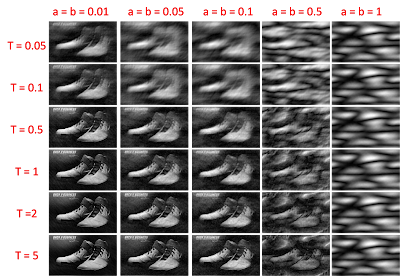
FIG 8. Reconstruction for different combinations of T and a=b. Generally, increasing T increases the quality of the image while increasing a=b decreases the quality of the image.

From the above image, increase in T leads to better reconstruction. This result is most logical since increasing the exposure time of the imaging device increases the number of photons detected and thus better image quality. Since a and b indicates the amount that the image is displaced, increasing a and b will lead to further blurring leading to poor image quality.

In this activity, I would give myself a grade of 9 for not knowing if the result is correct. I have doubts with the appearance of my transfer function and from the picture of the blurred image, it does not appear to be resembling that of a uniform linear blur. Instead, blurring seems to occur in both the x,y directions as oppose to single direction. The image cannot possibly move in both axis simultaneously. It is recommended that the form of the transfer function be checked for future research.

Acknowledgements
I would like to acknowledge Mark Jayson Villangca, Luis Buno and Miguel Sison for useful discussions.

References:
[1] Applied Physics 186 Activity 19 manual.
[2] image source

Tuesday, September 22, 2009

Activity 18: Noise model and basic image restoration

In image restoration, the objective is to recover the original image f(x,y) from the observed image g(x,y) with an a priori knowledge of the degradation process h(x,y) and the noise n(x,y) added on the image. This kind of modeling is shown in the figure below.

FIG 1: Image degradation and restoration model. The original image f(x,y) undergoes degradation by a known process h(x,y) and added with noise n(x,y) leading th the observed image g(x,y). With the use of restoration filters, image restoration aims to recover f(x,y). [1]

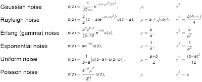
In this activity, we only cover half of the image restoration modelling by adding a known noise n(x,y) to the image and performing restoration algorithm to recover the original image. The strength and properties of the noise n(x,y) can be characterized from its probability distribution function PDF shown below for different noise models.
FIG 2: PDF of the different noise models used characterized by its mean and variance. (click to zoom)

The different noise models were generated using scilab's builtin grand and imnoise function. The Rayleigh noise was generated using a module modnum downloaded from [2] while the other noise were generated using grand and imnoise (see scilabs documentation for more detail on these functions). Below is the resulting image after adding different noise to a test image.

FIG 3: Image histograms after addition of different noise models.

Restoring in the presence of noise
Below are the different noise-reduction filters used when only noise is added to the image [1].

FIG 4: Mean filtering methods for a window of size m x n.

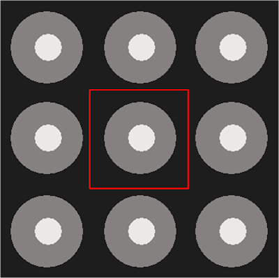
Consider a window, i.e., 3x3 window, we perform the 'mean filtering' on this window. For each pixel in the noisy image g(x,y), we choose a window and perform mean filtering for that pixel. This was done for all the pixels in the images. In order for the algorithm to be effective around the boundaries, the image was tiled in the manner below:

FIG 5: Tiled image to wrap the boundary conditions. The red window represents the area where the spatial noise filtering was applied.

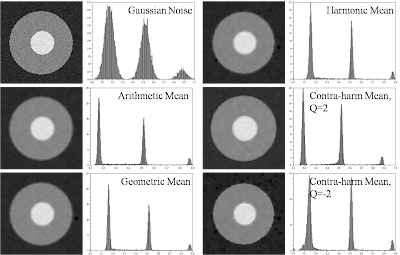
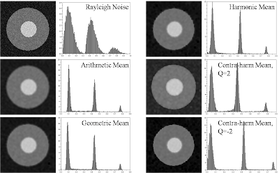
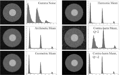
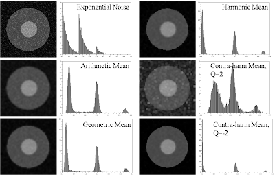
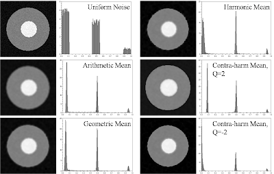
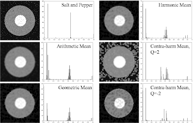
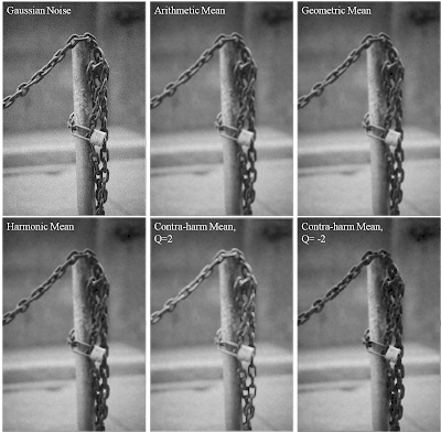
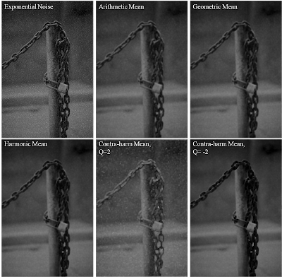
The following pictures below show the result of the restoration process using the different mean filtering methods in FIG 4 for each noise model. The window used is 5x5 and the restoration for the contraharmoic was divided into two depending on the value of Q, {Q=2 & Q=-2}.

FIG 6: Image restoration results for an image added with a Gaussian noise. Looking at the histogram, the restoration was generally successful for all methods except for some error on the shift of the graylevel value of the three peaks in the original image. In particular, geometric, harmonic and contra-harmonic (Q=-2) appear to shift the graylevel value to the right (towards white) relative to arithmetic and contra-harmonic (Q=2). This means that the image shifted to the left will appear darker relative to those shifted to the right.

FIG 7: Image restoration results for an image added with a Rayleigh noise. The restoration of the arithmetic and geometric filtering appears visually correct while for the contra-harmonic filtering, the image is either shifted to the left (Q=2) or right (Q=-2) depending on the value of Q used. Unlike geometric and arithmetic filtering, the histogram of harmonic and contra-harmonic filtering is wider along the peaks of the original image.

FIG 8: Image restoration results for an image added with a Gamma noise. In general, the restoration appears successful except for the contraharmoic (Q=2) restoration where the histogram of the image is more wider.

FIG 9: Image restoration results for an image added with an exponential noise. The contraharmonic restoration (Q=2 & Q=-2) failed in restoring the image due to wide histogram and overshifting to the left of the grayvalues. This degree of shifting is also manifested in the harmonic filtering.

FIG 10: Image restoration results for an image added with a uniform noise. In general, the restoration is quite successful for all methods.

FIG 11: Image restoration results for an image added with a salt & pepper noise. The restoration seems to have artifacts - presence of extra graylevel values. This could be attributed to the strength of the noise used which might be too strong and filtering on a 5 x 5 window is not sufficient to recover the image.

FIG 12. Applying the restoration process to a grayscale image shown above obtained from my brothers collection of images.

Applying this restoration to a grayscale image (obtained from my brother's picture collection), we perform the same method, adding a known noise term to the image and restoring the image using the mean filters of FIG 4.

FIG 13: Grayscale image added with Gaussian noise with the corresponding restorations.

FIG 14: Grayscale image added with Rayleigh noise with the corresponding restorations.

FIG 15: Grayscale image added with Gamma noise with the corresponding restorations.

FIG 16: Grayscale image added with an exponential noise with the corresponding restorations.

FIG 17: Grayscale image added with a uniform noise with the corresponding restorations.

FIG 18: Grayscale image added with salt & pepper noise with the corresponding restorations.

In general, geometric and arithemetic filtering work for all kinds of noise models presented. In particular, the author recommends geometric mean as it seems to be flexible and suitable enough for all noise models studied above.

In this activity, I give myself a grade of 10 for performing the restoration and doing all the required activities.

Acknowledgement
I would like to acknowledge Gilbert Gubatan for providing the downloaded modnum module for generating Rayleigh noise and my brother for lending one of his collection pictures.

References
[1] Image Restoration. fromhttp://www.ph.tn.tudelft.nl/~lucas/education/et2720in/2002/ImageRestoration.pdf
[2] http://www.scicos.org/ScicosModNum/modnum_web/src/modnum_421/interf/scicoslab/help/eng/htm/rayleigh_sim.htm

Thursday, September 17, 2009

Activity 17: Photometric Stereo

Photometric stereo is a technique that extracts surface elevation by computing the surface normals assuming the intensity is directly proportional to brightness. Using N light sources (V) , the surface normal of each point in the image can be computed following the steps in the image below. (click to zoom for clearer picture)


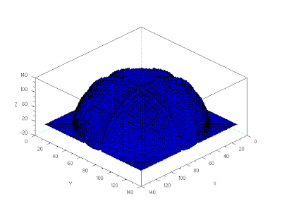
applying these steps to four light sources with images below, we reconstruct the corresponding shape elevation.

The result is shown below:
The reconstruction is relatively correct but with 'horns' on top and on the edges. Also the image is not smooth and some filtering is recommended.

In this activity, I give myself a grade of 10 for successfully reconstructing the image.

I would like to thank Martin Tensuan for useful discussions.

References:
[1] Applied Physisc 187 Manual (c)2008 Maricor Soriano

Monday, September 14, 2009

Activity 16: Neural Networks

In activity 15, we used Linear discriminant analysis (LDA) as predictor to classify chronic lymphocytic leukemia (CLLs) from lymphocytes using two different sets of features, {area perimeter} and {%red %green}. We already know that using perimeter and area as features would yield 100% classification for LDA and minimum distance algorithm while using %red and %green as features yield 90% success rate for LDA. In this activity we used neural network as predictor to classify CLLs and lymphocytes using the %red and %green as features. Similar to activity 15, we used 5 images of both CLLs and lymphocytes as training set and 5 images from both classes as test set. (see fig 2 and fig 3 of activity 14).

Neural network is a computational model that mimics the behavior of biological neurons, the brain for example[1]. Essentially, the idea of neural network is to assign weights on the input (say features), sums them and pass it to an activation function that processes the weighted input into an output. The process of determining the weights of the input is an iterative process with an a priori knowledge of the output. What neural network does is to compare its output with the desired output and adjust the weights of the input depending on the deviation from the desired output. This process is called the learning process of the network. After the network learns how to classify objects based from their features, classification of the test set is straightforward by feeding the network with the objects' features. For detailed discussion on the subject matter, refer to article in [2]

In order to understand more on how neural networks are modeled, fig 1 shows an artificial neuron as modeled by McCulloch and Pits (1943). A connection of many such neurons comprises a network.
Figure 1: Artificial neuron (left) and many connections of an artificial neuron leading to a neural network (right). It typically consists of an input layer followed by a hidden layer and an output layer.

In this activity, we used the ANN (artificial neural network) toolbox of scilab in performing artificial neural network computation. The process is straightforward and the parameter of interest adjusted are the learning rate and the training cycles. Table 1 shows the result of the computation for learning rate of 0.1, i.e., l=(0.1 0) and training cycle of 10000

Table 1: Neural network classification yielding 100% success rate for learning rate=0.1 and training cycle = 10000

We investigate the effect of learning rate and training cycle on the output of the neural network. We used the lymphocytes as test object, if the network's output is close to 1 the classification is correct otherwise it is wrong. For a constant learning rate (i.e 0.01) and increasing training cycle (1000-10000) we expect the output of the network to approach a limiting value as shown in fig 2. This implies that for increasing training cycle, the neural network is improving and is able to classify the object better.
Figure 2: Effect of different training cycle on the neural network's output for a constant learning rate(0.01). As shown, increasing the training cycle increases the output approaching the value 1 indicating that the network is learning better.

For a constant training cycle (1000) , and increasing learning rate (0.1-1), the result also approaches the limiting value of 1 as shown in figure 3.
Figure 3: Effect of different learning rate on the neural network's output for a constant training cycle (1000). As shown, increasing the learning rate increases the output approaching the value 1 indicating that the network is learning better.

In this activity, I give myself a grade of 10 for performing the classification well.

I would like to acknowledge Luis Buno for very useful discussions and for mentioning the idea of plotting the output for different training cycle and learning rate.

References
[1] http://en.wikipedia.org/wiki/Neural_Network#Learning_paradigms
[2] C. Bishop. Neural Networks and Their Applications. Rev. Sci. Instrum. 65(6),
June 1994.
[3] Applied Physics 186 Activity 16 (c)2008 Maricor Soriano

Activity 15: Probabilistic Classification

In the previous activity we used minimum distance classification as our predictor in classifying objects. Essentially, what we did is to calculate the deviation of an object from the mean features of different classes. However such classification fails when used with features that overlaps in both classes. In this activity we used Linear Discriminant analysis as predictor in classifying objects. We limit the number of classes to two and use the same features as the previous activity.

Consider the plot below of the features in phase space plot.
Figure 1: Phase space plot using area and perimeter. The regions are well segmented and we expect that simple minimum distance classification should work well as demonstrated in activity 14.
Figure 2: Phase space plot using red and green composition of the image. As can be seen, there are overlaps in both coordinates for both classes such that when the features (independent variables) are used alone, the classification would fail.

LDA transforms a class as a linear superposition of features and assumes therefore that features are linearly independent from each other. The aim of LDA is to minimize the error of classification that an object belongs to a certain class. The classification rule is that an object belongs to a class if it has the highest conditional probability in that class. The probability of "belongingness" can be computed using the formula below. It is worthwhile to state that the equation below was derived with the assumption that each class has normally distributed conditional probability[1-3].

where
  • ui: mean features in group i.
  • C: pooled covariance defined as
where ci is defined as the covariance matrix of group i, n is the total number of samples and ni is the number of samples in group i
  • Pi: prior probability usually assumed to be the number of samples in the group over the total number of samples, ni/n
  • xi: features data of group i.
  • xk: feature data of row k for a certain group.
Using the above formulas we compute for fi and determine the class with the highest f for each test object using the features in figure 1 and 2.

Table 1: Calculated values of f1 and f2 for different test objects using area and perimeter as features.
The classification is 100% as expected since the phase space plot of area and perimeter are already well segmented as shown in figure 1.

Table 2:Calculated values of f1 and f2 for different test objects using red and green composition as features.
The classfication failed 1/10 resulting to 90% success classification rate. This error is most probably due to the limited number of training sets (5) and the assumption of normal distribution conditional probability might not yet be satisfied.

In this activity, I give myself a grade of 10 for understanding a bit on LDA and performing the classifications well.

I would like to acknowledge Mark Jayson Villangca and Jay Samuel Combinido for useful discussions.

References:
[1] http://people.revoledu.com/kardi/tutorial/LDA/Numerical%20Example.html
[2] Applied Physics 186 Activity manual (c)2007 Maricor Soriano
[3] http://en.wikipedia.org/wiki/LDA

Thursday, September 10, 2009

Activity 14: Pattern Recognition

In pattern recognition, the idea is to mimic the human brain in classifying objects into class. Similar to object oriented programming, an object has methods or attributes called features which are common to objects belonging to a certain class. Pattern recognition has two tasks, (a) finding the appropriate features such as color, area or perimeter for efficient separation of classes and (b) finding a decision function that can classify objects into class. We can define the features as quantifiable properties and combine them together to form a feature vector. From the feature vector of objects, we use a method/function to classify them.

In this activity we employ the minimum distance classification to classify objects. We use five features: area, perimeter, % red, % blue and % green in classifying chronic lymphocytic leukemia (CLL) cells from lymphocytes (T cells or B cells) [1]. In order to classify objects, an a priori knowledge of a class and its set of features must first be establish. We can think of it as training the classifier for further classification later on. Below is the image of a collection of CLL cells and lymphocytes which we will use in our classification algorithm.

Figure 1: Chronic lymphocytic leukemia cells (i.e., those pointed by the arrows, blue) and lymphoytes (light violet).

From the above image, five cropped images of lymphocytes and CLL cells were used as training sets and five more images of both classes were used as test sets. In classifying the objects, the minimum distance classification is used which can be represented using the equation below:
where x is an array where each row represents an object and each column represents a feature, m is the mean feature for a certain class W. For each class W, we can obtain d and an object can be classified to a class if it has the largest value of d.

Below are the images used for the training sets and test sets for both classes (CLLs and lymphocytes). In order to extract the area and perimeter features, thresholding was used to segment the images (b) and bwlabel was used to clean the images from isolated spots (c) (see fig 2). Pixel count and the scilab's builtin command follow was used to extract the area and perimeter respectively.
Figure 2: Training set of images for both CLLs and lymphocytes with the corresponding image processing operations used (a) rgb (b) bw/thresholding and (c) bwlabel.

Figure 3: Test set of images for both CLLs and lymphocytes with the corresponding image processing operations used (a) rgb (b) bw/thresholding and (c) bwlabel.

The table below shows the mean features obtained from the training set. It can be seen that the area and perimeter features segments the classes pretty well as shown in figure 4.

Table 1: Mean features of CLLs and lymphocytes.
Figure 4: Phase space plot of area and perimeter as major classifiers for lymphocytes and CLLs.

The table below shows the result of the classification after computing d for both classes (CLL and lymphocytes) applying on the test sets of figure 3. The algorithm correctly identifies 10/10 objects giving 100% correct classification.

Table 2: Computed d of lymphocytes and CLLs.
In this activity, I give myself a grade of 10 for attaining the objectives of the activity, correctly classifying objects.

I would like to acknowledge Jay Samuel Combinido for very useful discussions.

References
[1] http://www.vet.uga.edu/vpp/clerk/waikart/index.php
[2] Applied Physics 186 activity 14 manual, (c)2008 Maricor Soriano

Activity 13: Correcting Geometric Distortions

Inherent in most imaging device is the presence of diffraction and aberration due to the finite collection aperture and geometry of the lens. Because of the shape and composition of the lens (i.e spherical), magnification and focusing is not isotropic resulting to unwanted distortions. Two of the most common distortions are pincushion and barrel distortion (fig 1).
Figure 1: Two kinds of radial distortion. (a) Barrel distortion appears expanded at the middle and pushed at the sides while (b) pincushion distortion is of the opposite, pushed at the middle and expanded at the sides. Images are taken from [1].

Distortions are usually undesirable in image processing especially in machine vision where slight distortions have major drawbacks [2]. Intuitively, a distorted image is the result of a transformation from an ideal image. Essentially, the process in correcting image distortion is to find the transformation from the ideal image to the distorted image.

Using a reference grid, we can correct image distortion as follows:
Figure 2: Transformation from ideal to distorted image of a grid. (a) Left distorted image can be mapped to the (b) ideal image using the transformation r and s assuming linear transformation in both directions simultaneously. This scheme is valid as long as the grid is not large relative to the image.

Consider fig 2, given the coordinates (x,y) of an ideal image (i.e., reference grid) we can find the distorted image coordinate x',y' using the transformation r, s by finding the coefficients c1-c8. The problem now reduces to solving systems of equation with eight unknown, c1-c8 (see fig 3). The eight equations can be obtained from the coordinates of the vertices (four corners) of the grid. It must be noted that the transformation is only valid inside the grid and the coefficients must be recomputed for a different grid.

Figure 3: Finding the coefficients c1-c8. From the matrix transformation T (x1-x4 and y1-y4 can be obtained from the four corners of the grid) we can obtain C's by matrix inversion of T and multiplying them with the x's and y's coordinate of the ideal grid.

Per pixel in the ideal grid, we can find the corresponding distorted coordinate r,s using the computed coefficients, c1-c8 (fig 2).

After finding the corresponding distorted coordinate, we have to find the graylevel value of the ideal image. If the computed distorted coordinate is integer valued, we just have to carry the graylevel value of the distorted image to the ideal image otherwise we have to interpolate. We use two kinds of interpolation, nearest neighbor and bilinear interpolation.

The nearest neighbor interpolation uses the graylevel value of the nearest integer-valued coordinate in the distorted image. This kind of reconstruction is very fast but the quality is poor and is ideal for thumbnails and images with relatively not varying graylevel value. On the other hand bilinear interpolation assumes linear interpolation in both directions simultaneously similar to what we did above. The graylevel value v can be obtained as follows (fig 4).
Figure 4: Finding the graylevel value v of the distorted image using the four neareast neighbors encompassing the distorted coordinate. The coefficients abcd can be found in a similar manner using fig 3.

Below is the result of the reconstruction using checkerboard and a distorted image of a window for nearest neighbor interpolation. To find the reference grid coordinates of the distorted image, scilab's locate was used to manually obtain the data points. Although this is very taxing, locating reference grid coordinates embedded with images is sometimes a formidable task. It is highly recommended though to obtain the coordinates using image processing techniques.


Figure 5: Nearest neighbor interpolation of (top) checkerboard and (bottom) distorted window. Typical of nearest neighbor interpolation is the presence of jagged regions due to the nature of the algorithm (picking the nearest neighbor). click to zoom.

For the checkerboard, nearest neighbor interpolation is already acceptable since the image is only black and white but for the window, the details of the image was slightly diminished and we need better interpolation scheme.

In bilinear interpolation, the quality is better compared to the nearest neighbor scheme but the speed is very much slower, figure 6 shows this result.

Figure 6: Bilinear interpolation of (top) checkerboard and (bottom) distorted window. The quality of the image is better compared to the nearest neighbor interpolation. click to zoom.

In this activity, I give myself a grade of 10 for correcting the distortion thereby achieving the goal of the activity.

I would like to acknowledge Mark Jayson Villangca, Jay Samuel Combinido and Luis Buno for all the help and jokes in doing this activity.

References
[1] http://en.wikipedia.org/wiki/Image_distortion
[2] Applied Physics 186 manula (c)2008 Maricor Soriano